Workstation Design
On workstations with visual display units
Visual displays with electronically generated images (visual display units or VDUs) represent the most characteristic element of computerized work equipment both in the workplace and in private life. A workstation may be designed to accommodate just a VDU and an input device (normally a keyboard), as a minimum; however, it can also provide room for diverse technical equipment including numerous screens, input and output devices, etc. As recently as the early 1980s, data entry was the most typical task for computer users. In many industrialized countries, however, this type of work is now performed by a relatively small number of users. More and more, journalists, managers and even executives have become “VDU users”.
Most VDU workstations are designed for sedentary work, but working in standing postures may offer some benefits for the users. Thus, there is some need for generic design guidelines applicable to simple and complex workstations used both while sitting and standing. Such guidelines will be formulated below and then applied to some typical workplaces.
Design guidelines
Workplace design and equipment selection should consider not only the needs of the actual user for a given task and the variability of users’ tasks during the relatively long life cycle of furniture (lasting 15 years or longer), but also factors related to maintenance or change of equipment. ISO Standard 9241, part 5, introduces four guiding principles to be applied to workstation design:
Guideline 1: Versatility and flexibility.
A workstation should enable its user to perform a range of tasks comfortably and efficiently. This guideline takes into account the fact that users’ tasks may vary often; thus, the chance of a universal adoption of guidelines for the workplace will be small.
Guideline 2: Fit.
The design of a workstation and its components should ensure a “fit” to be achieved for a variety of users and a range of task requirements. The concept of fit concerns the extent to which furniture and equipment can accommodate an individual user’s various needs, that is, to remain comfortable, free from visual discomfort and postural strain. If not designed for a specific user population, e.g., male European control room operators younger than 40 years of age, the workstation concept should ensure fit for the entire working population including users with special needs, e.g., handicapped persons. Most existing standards for furniture or the design of workplaces take only parts of the working population into consideration (e.g., “healthy” workers between the 5th and 95th percentile, aged between 16 and 60, as in German standard DIN 33 402), neglecting those who may need more attention.
Moreover, though some design practices are still based on the idea of an “average” user, an emphasis on individual fit is needed. With regard to workstation furniture, the fit required may be achieved by providing adjustability, designing a range of sizes, or even by custom-made equipment. Ensuring a good fit is crucial for the health and safety of the individual user, since musculoskeletal problems associated with the use of VDUs are common and significant.
Guideline 3: Postural change.
The design of the workstation should encourage movement, since static muscular load leads to fatigue and discomfort and may induce chronic musculoskeletal problems. A chair that allows easy movement of the upper half of the body, and provision of sufficient space to place and use paper documents as well as keyboards at varying positions during the day, are typical strategies for facilitating body movement while working with a VDU.
Guideline 4: Maintainability—adaptability.
The design of the workstation should take into consideration factors such as maintenance, accessibility, and the ability of the workplace to adapt to changing requirements, such as the ability to move the work equipment if a different task is to be performed. The objectives of this guideline have not received much attention in the ergonomics literature, because problems related to them are assumed to have been solved before users start to work at a workstation. In reality, however, a workstation is an ever-changing environment, and cluttered workspaces, partly or fully unsuitable for the tasks at hand, are very often not the result of their initial design process but are the outcome of later changes.
Applying the guidelines
Task analysis.
Workplace design should be preceded by a task analysis, which provides information about the primary tasks to be performed at the workstation and the equipment needed for them. In such an analysis, the priority given to information sources (e.g., paper-based documents, VDUs, input devices), the frequency of their use and possible restrictions (e.g., limited space) should be determined. The analysis should include major tasks and their relationships in space and time, visual attention areas (how many visual objects are to be used?) and the position and use of the hands (writing, typing, pointing?).
General design recommendations
Height of the work surfaces.
If fixed-height work surfaces are to be used, the minimum clearance between the floor and the surface should be greater than the sum of the popliteal height (the distance between the floor and the back of the knee) and thigh clearance height (sitting), plus allowance for footwear (25 mm for male users and 45 mm for female users). If the workstation is designed for general use, the popliteal height and thigh clearance height should be selected for the 95th percentile male population. The resulting height for the clearance under the desk surface is 690 mm for the population of Northern Europe and for North American users of European origin. For other populations, the minimum clearance needed is to be determined according to the anthropometric characteristics of the specific population.
If the legroom height is selected this way, the top of the work surfaces will be too high for a large proportion of intended users, and at least 30 per cent of them will need a footrest.
If work surfaces are adjustable in height, the required range for adjustment can be calculated from the anthropometric dimensions of female users (5th or 2.5th percentile for minimum height) and male users (95th or 97.5th percentile for maximum height). A workstation with these dimensions will in general be able to accommodate a large proportion of persons with little or no change. The result of such a calculation yields a range between 600 mm to 800 mm for countries with an ethnically varied user population. Since the technical realization of this range may cause some mechanical problems, best fit can also be achieved, for example, by combining adjustability with different size equipment.
The minimum acceptable thickness of the work surface depends on the mechanical properties of the material. From a technical point of view, a thickness between 14 mm (durable plastic or metal) and 30 mm (wood) is achievable.
Size and form of the work surface.
The size and the form of a work surface are mainly determined by the tasks to be performed and the equipment needed for those tasks.
For data entry tasks, a rectangular surface of 800 mm by 1200 mm provides sufficient space to place the equipment (VDU, keyboard, source documents and copy holder) properly and to rearrange the layout according to personal needs. More complex tasks may require additional space. Therefore, the size of the work surface should exceed 800 mm by 1,600 mm. The depth of the surface should allow placing the VDU within the surface, which means that VDUs with cathode ray tubes may require a depth of up to 1,000 mm.
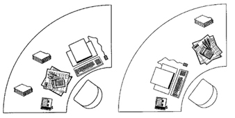
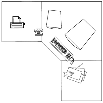
In principle, the layout displayed in figure 1 gives maximum flexibility for organizing the workspace for various tasks. However, workstations with this layout are not easy to construct. Thus, the best approximation of the ideal layout is as displayed in figure 2. This layout allows arrangements with one or two VDUs, additional input devices and so on. The minimum area of the work surface should be larger than 1.3 m2.
Figure 1. Layout of a flexible workstation that can be adapted to fit the needs of users with different tasks
Arranging the workspace.
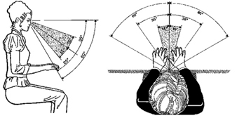
The spatial distribution of equipment in the workspace should be planned after a task analysis determining the importance and use frequency of each element has been conducted (table 1). The most frequently used visual display should be located within the central visual space, which is the shaded area of figure 3, while the most important and frequently used controls (such as the keyboard) should be located within optimum reach. In the workplace represented by the task analysis (table 1), the keyboard and the mouse are by far the most frequently handled pieces of equipment. Therefore, they should be given the highest priority within the reach area. Documents which are frequently consulted but do not need much handling should be assigned priority according to their importance (e.g., handwritten corrections). Placing them on the right-hand side of the keyboard would solve the problem, but this would create a conflict with the frequent use of the mouse which is also to be located to the right of the keyboard. Since the VDU may not need adjustment frequently, it can be placed to the right or left of the central field of vision, allowing the documents to be set on a flat document holder behind the keyboard. This is one possible, though not perfect, “optimized” solution.
Table 1. Frequency and importance of elements of equipment for a given task
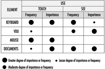
Figure 3. Visual workplace range
Since many elements of the equipment possess dimensions comparable to corresponding parts of the human body, using various elements within one task will always be associated with some problems. It also may require some movements between parts of the workstation; hence a layout like that shown in figure 1 is important for various tasks.
In the course of the last two decades, computer power that would have needed a ballroom at the beginning was successfully miniaturized and condensed into a simple box. However, contrary to the hopes of many practitioners that miniaturization of equipment would solve most problems associated with workplace layout, VDUs have continued to grow: in 1975, the most common screen size was 15"; in 1995 people bought 17" to 21”:monitors, and no keyboard has become much smaller than those designed in 1973. Carefully performed task analyses for designing complex workstations are still of growing importance. Moreover, although new input devices have emerged, they have not replaced the keyboard, and require even more space on the work surface, sometimes of substantial dimensions, e.g., graphic tablets in an A3-format.
Efficient space management within the limits of a workstation, as well as within work rooms, may help in developing acceptable workstations from an ergonomic point of view, thus preventing the emergence of various health and safety problems.
Efficient space management does not mean saving space at the expense of the usability of input devices and especially vision. Using extra furniture, such as a desk return, or a special monitor-holder clamped to the desk, may appear to be a good way to save desk space; however, it may be detrimental to posture (raised arms) and vision (raising the line of vision upwards from the relaxed position). Space-saving strategies should ensure that an adequate visual distance (approximately 600 mm to 800 mm) is maintained, as well as an optimum line-of-vision, obtained from an inclination of approximately 35º from the horizontal (20º head and 15º eyes).
New furniture concepts.
Traditionally, office furniture was adapted to the needs of businesses, supposedly reflecting the hierarchy of such organizations: large desks for executives working in “ceremonial” offices at one end of the scale, and small typists furniture for “functional” offices at the other. The basic design of office furniture did not change for decades. The situation changed substantially with the introduction of information technology, and a completely new furniture concept has emerged: that of systems furniture.
Systems furniture was developed when people realized that changes in working equipment and work organization could not be matched by the limited capabilities of existing furniture to adapt to new needs. Furniture today offers a tool-box that enables the user organizations to create workspace as needed, from a minimal space for just a VDU and a keyboard up to complex workstations that can accommodate various elements of equipment and possibly also groups of users. Such furniture is designed for change and incorporates efficient and flexible cable management facilities. While the first generation of systems furniture did not do much more than add an auxiliary desk for the VDU to an existing desk, the third generation has completely broken its ties to the traditional office. This new approach offers great flexibility in designing workspaces, limited only by the available space and the abilities of organizations to use this flexibility.
Radiation
Radiation in the context of VDU applications
Radiation is the emission or transfer of radiant energy. The emission of radiant energy in the form of light as the intended purpose for the use of VDUs may be accompanied by various unwanted by-products such as heat, sound, infrared and ultraviolet radiation, radio waves or x rays, to name a few. While some forms of radiation, like visible light, may affect humans in a positive way, some emissions of energy can have negative or even destructive biological effects, especially when the intensity is high and the duration of exposure is long. Some decades ago exposure limits for different forms of radiation were introduced to protect people. However, some of these exposure limits are questioned today, and, for low frequency alternating magnetic fields, no exposure limit can be given based on levels of natural background radiation.
Radiofrequency and microwave radiation from VDUs
Electromagnetic radiation with a frequency range from a few kHz to 109 Hertz (the so-called radiofrequency, or RF, band, with wavelengths ranging from some km to 30 cm) can be emitted by VDUs; however, the total energy emitted depends on the characteristics of the circuitry. In practice, however, the field strength of this type of radiation is likely to be small and confined to the immediate vicinity of the source. A comparison of the strength of alternating electric fields in the range of 20 Hz to 400 kHz indicates that VDUs using cathode ray tube (CRT) technology emit, in general, higher levels than other displays.
“Microwave” radiation covers the region between 3x10⁸ Hz to 3x10¹¹ Hz (wavelengths 100 cm to 1 mm). There are no sources of microwave radiation in VDUs that emit a detectable amount of energy within this band.
Magnetic fields
Magnetic fields from a VDU originate from the same sources as alternating electric fields. Although magnetic fields are not “radiation”, alternating electric and magnetic fields cannot be separated in practice, since one induces the other. One reason why magnetic fields are discussed separately is that they are suspected to have teratogenic effects (see discussion later in this chapter).
Although the fields induced by VDUs are weaker than those induced by some other sources, such as high-voltage power lines, power plants, electrical locomotives, steel ovens and welding equipment, the total exposure produced by VDUs may be similar since people may work eight or more hours in the vicinity of a VDU but seldom near power lines or electric motors. The question of the relationship between electromagnetic fields and cancer, however, is still a matter for debate.
Optical radiation
“Optical” radiation covers visible radiation (i.e., light) with wavelengths from 380 nm (blue) to 780 nm (red), and the neighbouring bands in the electromagnetic spectrum (infrared from 3x10¹¹ Hz to 4x10¹⁴ Hz, wavelengths from 780 nm to 1 mm; ultraviolet from 8x10¹⁴ Hz to 3x10¹⁷ Hz). Visible radiation is emitted at moderate levels of intensity comparable with that emitted by room surfaces (»100 cd/m2). However, ultraviolet radiation is trapped by the glass of the tube face (CRTs) or not emitted at all (other display technologies). Levels of ultraviolet radiation, if detectable at all, stay well below occupational exposure standards, as do those of infrared radiation.
X rays
CRTs are well-known sources of x rays, while other technologies like liquid crystal displays (LCDs) do not emit any. The physical processes behind emissions of this type of radiation are well understood, and tubes and circuitry are designed to keep the emitted levels far below the occupational exposure limits, if not below detectable levels. Radiation emitted by a source can only be detected if its level exceeds the background level. In the case of x rays, as for other ionizing radiation, the background level is provided by cosmic radiation and by radiation from radioactive materials in the ground and in buildings. In normal operation, a VDU does not emit x rays exceeding the background level of radiation (50 nGy/h).
Radiation recommendations
In Sweden, the former MPR (Statens Mät och Provråd, the National Council for Metrology and Testing) organization, now SWEDAC, has worked out recommendations for evaluating VDUs. One of their main objectives was to limit any unwanted by-product to levels that can be achieved by reasonable technical means. This approach goes beyond the classical approach of limiting hazardous exposures to levels where the likelihood of an impairment of health and safety seems to be acceptably low.
At the beginning, some recommendations of MPR led to the unwanted effect of reducing the optical quality of CRT displays. However, at present, only very few products with extremely high resolution may suffer any degradation if the manufacturer attempts to comply with the MPR (now MPR-II). The recommendations include limits for static electricity, magnetic and electric alternating fields, visual parameters, etc.
Image Quality
Definitions for image quality
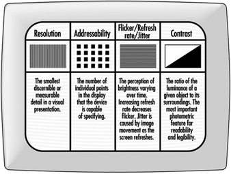
The term quality describes the fit of distinguishing attributes of an object for a defined purpose. Thus, the image quality of a display includes all properties of the optical representation regarding the perceptibility of symbols in general, and the legibility or readability of alphanumeric symbols. In this sense, optical terms used by tube manufacturers, like resolution or minimum spot size, describe basic quality criteria concerning the abilities of a given device for displaying thin lines or small characters. Such quality criteria are comparable with the thickness of a pencil or brush for a given task in writing or painting.
Some of the quality criteria used by ergonomists describe optical properties that are relevant for legibility, e.g., contrast, while others, like character size or stroke width, refer more to typographical features. In addition, some technology-dependent features like the flicker of images, the persistence of images, or the uniformity of contrast within a given display are also considered in ergonomics (see figure 4).
Figure 4. Criteria for image evaluation
Typography is the art of composing “type”, which is not only shaping the fonts, but also selecting and setting of type. Here, the term typography is used in the first meaning.
Basic characteristics
Resolution.
Resolution is defined as the smallest discernible or measurable detail in a visual presentation. For example, the resolution of a CRT display can be expressed by the maximum number of lines that can be displayed in a given space, as usually done with the resolution of photographic films. One can also describe the minimum spot size that a device can display at a given luminance (brightness). The smaller the minimum spot, the better the device. Thus, the number of dots of minimum size (picture elements—also known as pixels) per inch (dpi) represents the quality of the device, e.g., a 72 dpi device is inferior to a 200 dpi display.
In general, the resolution of most computer displays is well below 100 dpi: some graphic displays may achieve 150 dpi, however, only with limited brightness. This means, if a high contrast is required, the resolution will be lower. Compared with the resolution of print, e.g., 300 dpi or 600 dpi for laser printers, the quality of VDUs is inferior. (An image with 300 dpi has 9 times more elements in the same space than a 100 dpi image.)
Addressability.
Addressability describes the number of individual points in the field that the device is capable of specifying. Addressability, which is very often confused with resolution (sometimes deliberately), is one specification given for devices: “800 x 600” means that the graphic board can address 800 points on every one of 600 horizontal lines. Since one needs at least 15 elements in the vertical direction to write numbers, letters and other characters with ascenders and descenders, such a screen can display a maximum of 40 lines of text. Today, the best available screens can address 1,600 x 1,200 points; however, most displays used in industry address 800 x 600 points or even less.
On displays of the so-called “character-oriented” devices, it is not dots (points) of the screen that are addressed but character boxes. In most such devices, there are 25 lines with 80 character positions each in the display. On these screens, each symbol occupies the same space regardless of its width. In industry the lowest number of pixels in a box is 5 wide by 7 high. This box allows both upper and lower case characters, although the descenders in “p”, “q” and “g”, and the ascenders above “Ä” or “Á” cannot be displayed. Considerably better quality is provided with the 7 x 9 box, which has been “standard” since the mid-1980s. To achieve good legibility and reasonably good character shapes, the character box size should be at least 12 x 16.
Flicker and refresh rate.
The images on CRTs and on some other types of VDU are not persistent images, as on paper. They only appear to be steady by taking advantage of an artefact of the eye. This, however, is not without penalty, since the screen tends to flicker if the image is not refreshed constantly. Flicker can influence both performance and comfort of the user and should always be avoided.
Flicker is the perception of brightness varying over time. The severity of flicker depends on various factors such as the characteristics of the phosphor, size and brightness of the flickering image, etc. Recent research shows that refresh rates up to 90 Hz may be needed to satisfy 99 per cent of users, while in earlier research, refresh rates well below 50 Hz were thought to be satisfactory. Depending on various features of the display, a flicker-free image may be achieved by refresh rates between 70 Hz and 90 Hz; displays with a light background (positive polarity) need a minimum of 80 Hz to be perceived as flicker-free.
Some modern devices offer an adjustable refresh rate; unfortunately, higher refresh rates are coupled with lower resolution or addressability. The ability of a device to display high “resolution” images with high refresh rates can be assessed by its video bandwidth. For displays with high quality, the maximum video bandwidth lies above 150 MHz, while some displays offer less than 40 MHz.
To achieve a flicker-free image and a high resolution with devices with lower video bandwidth, the manufacturers apply a trick that stems from commercial TV: the interlace mode. In this case, every second line on the display is refreshed with a given frequency. The result, however, is not satisfactory if static images, such as text and graphics, are displayed and the refresh rate is below 2 x 45 Hz. Unfortunately, the attempt to suppress the disturbing effect of flicker may induce some other negative effects.
Jitter.
Jitter is the result of spatial instability of the image; a given picture element is not displayed at the same location on the screen after each refresh process. The perception of jitter cannot be separated from the perception of flicker.
Jitter may have its cause in the VDU itself, but it can also be induced by interaction with other equipment at the workplace, such as a printer or other VDUs or devices that generate magnetic fields.
Contrast.
Brightness contrast, the ratio of the luminance of a given object to its surroundings, represents the most important photometric feature for readability and legibility. While most standards require a minimum ratio of 3:1 (bright characters on dark background) or 1:3 (dark characters on bright background), optimum contrast is actually about 10:1, and devices of good quality achieve higher values even in bright environments.
The contrast of “active” displays is impaired when the ambient light is increased, while “passive” displays (e.g., LCDs) lose contrast in dark environments. Passive displays with background lighting may offer good visibility in all environments under which people may work.
Sharpness.
Sharpness of an image is a well-known, but still ill-defined feature. Hence, there is no agreed-upon method to measure sharpness as a relevant feature for legibility and readability.
Typographical features
Legibility and readability.
Readability refers to whether a text is understandable as a series of connected images, while legibility refers to the perception of single or grouped characters. Thus, good legibility is, in general, a precondition for readability.
Legibility of text depends on several factors: some have been investigated thoroughly, while other relevant factors like character shapes are yet to be classified. One of the reasons for this is that the human eye represents a very powerful and robust instrument, and the measures used for performance and error rates often do not help to distinguish between different fonts. Thus, to some extent, typography still remains an art rather than a science.
Fonts and readability.
A font is a family of characters, designed to yield either optimum readability on a given medium, e.g., paper, electronic display or projection display, or some desired aesthetic quality, or both. While the number of available fonts exceeds ten thousand, only a few fonts, numbered in tens, are believed to be “readable”. Since legibility and readability of a font are also affected by the experience of the reader—some “legible” fonts are believed to have become so because of decades or even centuries of use without changing their shape—the same font may be less legible on a screen than on paper, merely because its characters look “new”. This, however, is not the main reason for the poor legibility of screens.
In general, the design of screen fonts is restricted by shortcomings in technology. Some technologies impose very narrow limits on the design of characters, e.g., LEDs or other rastered screens with limited numbers of dots per display. Even the best CRT displays can seldom compete with print (figure 5). In the last years, research has shown that speed and accuracy of reading on screens is about 30% lower than on paper, but whether this is due to features of the display or to other factors is not yet known.
Figure 5. Appearance of a letter at various screen resolutions and on paper (right)

Characteristics with measurable effects.
The effects of some characteristics of alphanumeric representations are measurable, e.g., apparent size of the characters, height/width ratio, stroke width/size ratio, line, word and character spacing.
The apparent size of the characters, measured in minutes of arc, shows an optimum by 20' to 22'; this corresponds to about 3 mm to 3.3 mm in height under normal viewing conditions in offices. Smaller characters may lead to increased errors, visual strain, and also to more postural strain due to restricted viewing distance. Thus, text should not be represented in an apparent size of less than 16'.
However, graphical representations may require text of smaller size to be displayed. To avoid errors, on the one hand, and a high visual load for the user on the other, parts of the text to be edited should be displayed in a separate window to assure good readability. Characters with an apparent size of less than 12' should not be displayed as readable text, but replaced by a rectangular grey block. Good programs allow the user to select the minimum actual size of characters that are to be displayed as alphanumerics.
The optimum height/width ratio of characters is about 1:0.8; legibility is impaired if the ratio is above 1:0.5. For good legible print and also for CRT screens, the ratio of character height to stroke width is about 10:1. However, this is only a rule of thumb; legible characters of high aesthetical value often show different stroke widths (see figure 5).
Optimal line spacing is very important for readability, but also for space saving, if a given amount of information is to be displayed in limited space. The best example for this is the daily newspaper, where an enormous amount of information is displayed within a page, but is still readable. The optimum line spacing is about 20% of character height between the descenders of a line and the ascenders of the next; this is a distance of about 100% of the character height between the baseline of a line of text and the ascenders of the next. If the length of the line is reduced, the space between the lines may be reduced, too, without losing readability.
Character spacing is invariable on character-oriented screens, making them inferior in readability and aesthetic quality to displays with variable space. Proportional spacing depending on the shape and width of the characters is preferable. However, a typographical quality comparable to well-designed printed fonts is achievable only on few displays and when using specific programs.
Ambient Lighting
The specific problems of VDU workstations
During the last 90 years of industrial history, the theories about the lighting of our workplaces have been governed by the notion that more light will improve vision, reduce stress and fatigue, as well as enhance performance. “More light”, correctly speaking “more sunlight”, was the slogan of people in Hamburg, Germany, more than 60 years ago when they took to the streets to fight for better and healthier homes. In some countries like Denmark or Germany, workers today are entitled to have some daylight at their workplaces.
The advent of information technology, with the emergence of the first VDUs in working areas, was presumably the first event ever when workers and scientists began to complain about too much light in working areas. The discussion was fuelled by the easily detectable fact that most VDUs were equipped with CRTs, which have curved glass surfaces prone to veiling reflections. Such devices, sometimes called “active displays”, lose contrast when the level of ambient lighting becomes higher. Redesigning lighting to reduce the visual impairments caused by these effects, however, is complicated by the fact that most users also use paper-based information sources, which generally require increased levels of ambient light for good visibility.
The role of ambient light
Ambient light found in the vicinity of VDU workstations serves two different purposes. First, it illuminates the workspace and working materials like paper, telephones, etc. (primary effect). Secondly, it illuminates the room, giving it its visible shape and giving the users the impression of a light surrounding (secondary effect). Since most lighting installations are planned according to the concept of general lighting, the same lighting sources serve both purposes. The primary effect, illuminating passive visual objects to make them visible or legible, became questionable when people started to use active screens that do not need ambient light to be visible. The remaining benefit of the room lighting was reduced to the secondary effect, if the VDU is the major source of information.
The function of VDUs, both of CRTs (active displays) and of LCDs (passive displays), is impaired by the ambient light in specific ways:
CRTs:
- The curved glass surface reflects bright objects in the environment, and forms a kind of visual “noise”.
- Depending on the intensity of ambient illumination, the contrast of displayed objects is reduced to a degree that readability or legibility of the objects is impaired.
- Images on colour CRTs suffer a twofold degradation: First, the brightness contrast of all displayed objects is reduced, as on monochrome CRTs. Secondly, the colours are changed so that colour contrast is also reduced. In addition, the number of distinguishable colours is reduced.
LCDs (and other passive displays):
- The reflections on LCDs cause less concern than those on CRT surfaces, since these displays have flat surfaces.
- In contrast to active displays, LCDs (without backlight) lose contrast under low levels of ambient illumination.
- Due to poor directional characteristics of some display technologies, visibility or legibility of displayed objects is substantially reduced if the main direction of light incidence is unfavourable.
The extent to which such impairments exert a stress on users or lead to a substantial reduction of visibility/readability/legibility of visual objects in real working environments varies greatly. For example, the contrast of alphanumeric characters on monochrome (CRT) displays is reduced in principle, but, if the illuminance on the screen is ten times higher than in normal working environments, many screens will still have a contrast sufficient to read alphanumeric characters. On the other hand, colour displays of computer-aided design (CAD) systems decrease substantially in visibility so that most users prefer to dim the artificial lighting or even to switch it off, and, in addition, to keep the daylight out of their working area.
Possible remedies
Changing illuminance levels.
Since 1974, numerous studies have been performed which led to recommendations for reducing illuminance at the workplace. However, these recommendations were mostly based on studies with unsatisfactory screens. The recommended levels were between 100 lux and 1,000 lx, and generally, levels well below the recommendations of the existing standards for office lighting (e.g., 200 lx or 300 to 500 lx) have been discussed.
When positive screens with a luminance of approximately 100 cd/m2 brightness and some kind of efficient anti-glare treatment are used, the utilization of a VDU does not limit the acceptable illuminance level, since users find illuminance levels up to 1,500 lx acceptable, a value which is very rare in working areas.
If the relevant characteristics of the VDUs do not allow comfortable working under normal office lighting, as can occur when working with storage tubes, microimage readers, colour screens etc., the visual conditions can be improved substantially by introducing two-component lighting. Two-component lighting is a combination of indirect room lighting (secondary effect) and direct task lighting. Both components should be controllable by the users.
Controlling glare on screens.
Controlling glare on screens is a difficult task since almost all remedies that improve the visual conditions are likely to impair some other important characteristic of the display. Some remedies, proposed for many years, such as mesh filters, remove reflections from the displays but they also impair the legibility of the display. Low luminance luminaires cause less reflected glare on screens, but the quality of such lighting generally is judged by users to be worse than that of any other type of lighting.
For this reason, any measures (see figure 6) should be applied cautiously, and only after analysing the real cause of the annoyance or disturbance. Three possible ways of controlling glare on screens are: selection of the correct location of the screen with respect to glare sources; selection of suitable equipment or addition of elements to it; and use of lighting. The costs of the measures to be taken are of the same order: it costs almost nothing to place screens in such a way as to eliminate reflected glare. However, this may not be possible in all cases; thus, equipment-related measures will be more expensive but may be necessary in various working environments. Glare control by lighting is often recommended by lighting specialists; however, this method is the most expensive but not the most successful way of controlling glare.
Figure 6. Strategies for controlling glare on screens
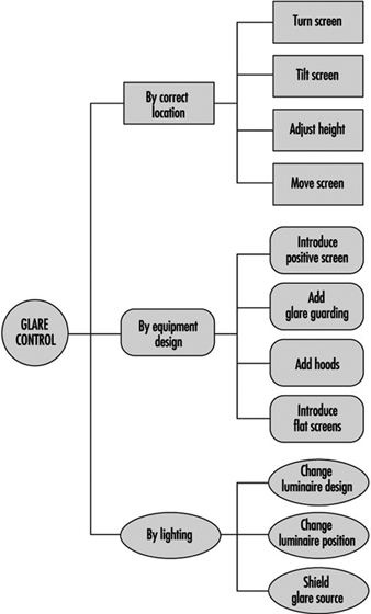
The most promising measure at present is the introduction of positive screens (displays with bright background) with an additional anti-glare treatment for the glass surface. Even more successful than this will be the introduction of flat screens with a nearly matt surface and bright background; such screens, however, are not available for general use today.
Adding hoods to displays is the ultima ratio of the ergonomists for difficult work environments like production areas, towers of airports or operator cabins of cranes, etc. If hoods are really needed, it is likely that there will be more severe problems with lighting than just reflected glare on visual displays.
Changing luminaire design is mainly accomplished in two ways: first, by reducing the luminance (corresponds to apparent brightness) of parts of the light fittings (so called “VDU lighting”), and secondly, by introducing indirect light instead of direct light. The results of current research show that introducing indirect light yields substantial improvements for users, reduces visual load, and is well accepted by users.