Karl H. E. Kroemer
In what follows, three of the most important concerns of ergonomic design will be examined: first, that of controls, devices to transfer energy or signals from the operator to a piece of machinery; second, indicators or displays, which provide visual information to the operator about the status of the machinery; and third, the combination of controls and displays in a panel or console.
Designing for the Sitting Operator
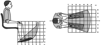
Sitting is a more stable and less energy-consuming posture than standing, but it restricts the working space, particularly of the feet, more than standing. However, it is much easier to operate foot controls when sitting, as compared to standing, because little body weight must be transferred by the feet to the ground. Furthermore, if the direction of the force exerted by the foot is partly or largely forward, provision of a seat with a backrest allows the exertion of rather large forces. (A typical example of this arrangement is the location of pedals in an automobile, which are located in front of the driver, more or less below seat height.) Figure 1 shows schematically the locations in which pedals may be located for a seated operator. Note that the specific dimensions of that space depend on the anthropometry of the actual operators.
Figure 1. Preferred and regular workspace for feet (in centimetres)
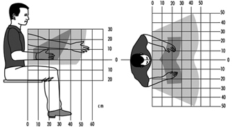
The space for the positioning of hand-operated controls is primarily located in front of the body, within a roughly spherical contour that is centred at either the elbow, at the shoulder, or somewhere between those two body joints. Figure 2 shows schematically that space for the location of controls. Of course, the specific dimensions depend on the anthropometry of the operators.
Figure 2. Preferred and regular workspace for hands (in centimetres)
The space for displays and for controls that must be looked at is bounded by the periphery of a partial sphere in front of the eyes and centred at the eyes. Thus, the reference height for such displays and controls depends on the eye height of the seated operator and on his or her trunk and neck postures. The preferred location for visual targets closer than about one metre is distinctly below the height of the eye, and depends on the closeness of the target and on the posture of the head. The closer the target, the lower it should be located, and it should be in or near the medial (mid-sagittal) plane of the operator.
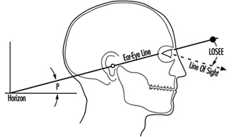
It is convenient to describe the posture of the head by using the “ear-eye line” (Kroemer 1994a) which, in the side view, runs through the right ear hole and the juncture of the lids of the right eye, while the head is not tilted to either side (the pupils are at the same horizontal level in the frontal view). One usually calls the head position “erect” or “upright” when the pitch angle P (see figure 3) between the ear-eye line and the horizon is about 15°, with the eyes above the height of the ear. The preferred location for visual targets is 25°–65° below the ear-eye line (LOSEE in figure 3), with the lower values preferred by most people for close targets that must be kept in focus. Even though there are large variations in the preferred angles of the line of sight, most subjects, particularly as they become older, prefer to focus on close targets with large LOSEE angles.
Designing for the Standing Operator
Pedal operation by a standing operator should be seldom required, because otherwise the person must spend too much time standing on one foot while the other foot operates the control. Obviously, simultaneous operation of two pedals by a standing operator is practically impossible. While the operator is standing still, the room for the location of foot controls is limited to a small area below the trunk and slightly in front of it. Walking about would provide more room to place pedals, but that is highly impractical in most cases because of the walking distances involved.
The location for hand-operated controls of a standing operator includes about the same area as for a seated operator, roughly a half sphere in front of the body, with its centre near the shoulders of the operator. For repeated control operations, the preferred part of that half sphere would be its lower section. The area for the location of displays is also similar to the one suited to a seated operator, again roughly a half sphere centred near the operator’s eyes, with the preferred locations in the lower section of that half sphere. The exact locations for displays, and also for controls that must be seen, depends on the posture of the head, as discussed above.
The height of controls is appropriately referenced to the height of the elbow of the operator while the upper arm is hanging from the shoulder. The height of displays and controls that must be looked at is referred to the eye height of the operator. Both depend on the operator’s anthropometry, which may be rather different for short and tall persons, for men and women, and for people of different ethnic origins.
Foot-operated Controls
Two kinds of controls should be distinguished: one is used to transfer large energy or forces to a piece of machinery. Examples of this are the pedals on a bicycle or the brake pedal in a heavier vehicle that does not have a power-assist feature. A foot-operated control, such as an on-off switch, in which a control signal is conveyed to the machinery, usually requires only a small quantity of force or energy. While it is convenient to consider these two extremes of pedals, there are various intermediate forms, and it is the task of the designer to determine which of the following design recommendations apply best among them.
As mentioned above, repeated or continual pedal operation should be required only from a seated operator. For controls meant to transmit large energies and forces, the following rules apply:
- Locate pedals underneath the body, slightly in front, so that they can be operated with the leg in a comfortable position. The total horizontal displacement of a reciprocating pedal should normally not exceed about 0.15 m. For rotating pedals, the radius should also be about 0.15 m. The linear displacement of a switch-type pedal may be minimal and should not exceed about 0.15 m.
- Pedals should be so designed that the direction of travel and the foot force are approximately in the line extending from the hip through the ankle joint of the operator.
- Pedals that are operated by flexion and extension of the foot in the ankle joint should be so arranged that in the normal position the angle between the lower leg and the foot is approximately 90°; during operation, that angle may be increased to about 120°.
- Foot-operated controls that simply provide signals to the machinery should normally have two discrete positions, such as ON or OFF. Note, however, that tactile distinction between the two positions may be difficult with the foot.
Selection of Controls
Selection among different sorts of controls must be made according to the following needs or conditions:
- Operation by hand or foot
- Amounts of energies and forces transmitted
- Applying “continuous” inputs, such as steering an automobile
- Performing “discrete actions,” for example, (a) activating or shutting down equipment, (b) selecting one of several distinct adjustments, such as switching from one TV or radio channel to another, or (c) carrying out data entry, as with a keyboard.
The functional usefulness of controls also determines selection procedures. The main criteria are as follows:
- The control type shall be compatible with stereotypical or common expectations (for instance, using a push-button or toggle switch to turn on an electric light, not a rotary knob).
- Size and motion characteristics of the control shall be compatible with stereotypical experience and past practice (for instance, providing a large steering wheel for the two-handed operation of an automobile, not a lever).
- The direction of operation of a control shall be compatible with stereotypical or common expectations (for instance, an ON control is pushed or pulled, not turned to the left).
- Hand operation is used for controls that require small force and fine adjustment, while foot operation is suitable for gross adjustments and large forces (however, consider the common use of pedals, particularly accelerator pedals, in automobiles, which does not comply with this principle).
- The control shall be “safe” in that it cannot be operated inadvertently nor in ways that are excessive or inconsistent with its intended purpose.
Table 1. Control movements and expected effects
|
Direction of control movement |
||||||||||||
|
Function |
Up |
Right |
Forward |
Clockwise |
Press, |
Down |
Left |
Rearward |
Back |
Counter- |
Pull1 |
Push2 |
|
On |
+3 |
+ |
+ |
+ |
– |
+3 |
+ |
|||||
|
Off |
+ |
– |
– |
+ |
– |
|||||||
|
Right |
+ |
– |
||||||||||
|
Left |
+ |
– |
||||||||||
|
Raise |
+ |
– |
||||||||||
|
Lower |
– |
+ |
||||||||||
|
Retract |
– |
+ |
– |
|||||||||
|
Extend |
+ |
– |
– |
|||||||||
|
Increase |
– |
– |
+ |
– |
||||||||
|
Decrease |
– |
– |
+ |
– |
||||||||
|
Open Value |
– |
+ |
||||||||||
|
Close Value |
+ |
– |
||||||||||
Blank: Not applicable; + Most preferred; – less preferred. 1 With trigger-type control. 2 With push-pull switch. 3 Up in the United States, down in Europe.
Source: Modified from Kroemer 1995.
Table 1 and table 2 help in the selection of proper controls. However, note that there are few “natural” rules for selection and design of controls. Most current recommendations are purely empirical and apply to existing devices and Western stereotypes.
Table 2. Control-effect relations of common hand controls
|
Effect |
Key- |
Toggle |
Push- |
Bar |
Round |
Thumbwheel |
Thumbwheel |
Crank |
Rocker switch |
Lever |
Joystick |
Legend |
Slide1 |
|
Select ON/OFF |
+ |
+ |
+ |
= |
+ |
+ |
+ |
||||||
|
Select ON/STANDBY/OFF |
– |
+ |
+ |
+ |
+ |
+ |
|||||||
|
Select OFF/MODE1/MODE2 |
= |
– |
+ |
+ |
+ |
+ |
|||||||
|
Select one function of several related functions |
– |
+ |
– |
= |
|||||||||
|
Select one of three or more discrete alternatives |
+ |
+ |
|||||||||||
|
Select operating condition |
+ |
+ |
– |
+ |
+ |
– |
|||||||
|
Engage or disengage |
+ |
||||||||||||
|
Select one of mutually |
+ |
+ |
|||||||||||
|
Set value on scale |
+ |
– |
= |
= |
= |
+ |
|||||||
|
Select value in discrete steps |
+ |
+ |
+ |
+ |
Blank: Not applicable; +: Most preferred; –: Less preferred; = Least preferred. 1 Estimated (no experiments known).
Source: Modified from Kroemer 1995.
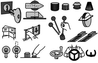
Figure 4 presents examples of “detent” controls, characterized by discrete detents or stops in which the control comes to rest. It also depicts typical “continuous” controls where the control operation may take place anywhere within the adjustment range, without the need to be set in any given position.
Figure 4. Some examples of "detent" and "continuous" controls
The sizing of controls is largely a matter of past experiences with various control types, often guided by the desire to minimize the needed space in a control panel, and either to allow simultaneous operations of adjacent controls or to avoid inadvertent concurrent activation. Furthermore, the choice of design characteristics will be influenced by such considerations as whether the controls are to be located outdoors or in sheltered environments, in stationary equipment or moving vehicles, or may involve the use of bare hands or of gloves and mittens. For these conditions, consult readings at the end of the chapter.
Several operational rules govern the arrangement and grouping of controls. These are listed in table 3. For more details, check the references listed at the end of this section and Kroemer, Kroemer and Kroemer-Elbert (1994).
Table 3. Rules for arrangement of controls
|
Locate for the |
Controls shall be oriented with respect to the operator. If the |
|
Primary controls |
The most important controls shall have the most advantageous |
|
Group related |
Controls that are operated in sequence, that are related to a |
|
Arrange for |
If operation of controls follows a given pattern, controls shall |
|
Be consistent |
The arrangement of functionally identical or similar controls |
|
Dead-operator |
If the operator becomes incapacitated and either lets go of a |
|
Select codes |
There are numerous ways to help identify controls, to indicate |
Source: Modified from Kroemer, Kroemer and Kroemer-Elbert 1994.
Reproduced by permission of Prentice-Hall. All rights reserved.
Preventing Accidental Operation
The following are the most important means to guard against inadvertent activation of controls, some of which may be combined:
- Locate and orient the control so that the operator is unlikely to strike it or move it accidentally in the normal sequence of control operations.
- Recess, shield or surround the control by physical barriers.
- Cover the control or guard it by providing a pin, a lock or other means that must be removed or broken before the control can be operated.
- Provide extra resistance (by viscous or coulomb friction, by spring-loading or by inertia) so that an unusual effort is required for actuation.
- Provide a “delaying” means so that the control must pass through a critical position with an unusual movement (such as in the gear shift mechanism of an automobile).
- Provide interlocking between controls so that prior operation of a related control is required before the critical control can be activated.
Note that these designs usually slow the operation of controls, which may be detrimental in case of an emergency.
Data Entry Devices
Nearly all controls can be used to enter data on a computer or other data storage device. However, we are most used to the practice of using a keyboard with push-buttons. On the original typewriter keyboard, which has become the standard even for computer keyboards, the keys were arranged in a basically alphabetic sequence, which has been modified for various, often obscure, reasons. In some cases, letters which frequently follow each other in common text were spaced apart so that the original mechanical type bars might not entangle if struck in rapid sequence. “Columns” of keys run in roughly straight lines, as do the “rows” of keys. However, the fingertips are not aligned in such manners, and do not move in this way when digits of the hand are flexed or extended, or moved sideways.
Many attempts have been made over the last hundred years to improve keying performance by changing the keyboard layout. These include relocating keys within the standard layout, or changing the keyboard layout altogether. The keyboard has been divided into separate sections, and sets of keys (such as numerical pads) have been added. Arrangements of adjacent keys may be changed by altering spacing, offset from each other or from reference lines. The keyboard may be divided into sections for the left and right hand, and those sections may be laterally tilted and sloped and slanted.
The dynamics of the operation of push-button keys are important for the user, but are difficult to measure in operation. Thus, the force-displacement characteristics of keys are commonly described for static testing, which is not indicative of actual operation. By current practise, keys on computer keyboards have fairly little displacement (about 2 mm) and display a “snap-back” resistance, that is, a decrease in operation force at the point when actuation of the key has been achieved. Instead of separate single keys, some keyboards consist of a membrane with switches underneath which, when pressed in the correct location, generate the desired input with little or no displacement felt. The major advantage of the membrane is that dust or fluids cannot penetrate it; however, many users dislike it.
There are alternatives to the “one key-one character” principle; instead, one can generate inputs by various combinatory means. One is “chording”, meaning that two or more controls are operated simultaneously to generate one character. This poses demands on the memory capabilities of the operator, but requires the use of only very few keys. Other developments utilize controls other than the binary tapped push button, replacing it by levers, toggles or special sensors (such as an instrumented glove) which respond to movements of the digits of the hand.
By tradition, typing and computer entry have been made by mechanical interaction between the operator’s fingers and such devices as keyboard, mouse, track ball or light pen. Yet there are many other means to generate inputs. Voice recognition appears one promising technique, but other methods can be employed. They might utilize, for example, pointing, gestures, facial expressions, body movements, looking (directing one’s gaze), movements of the tongue, breathing or sign language to transmit information and to generate inputs to a computer. Technical development in this area is very much in flux, and as the many nontraditional input devices used for computer games indicate, acceptance of devices other than the traditional binary tap-down keyboard is entirely feasible within the near future. Discussions of current keyboard devices have been provided, for example, by Kroemer (1994b) and McIntosh (1994).
Displays
Displays provide information about the status of equipment. Displays may apply to the operator’s visual sense (lights, scales, counters, cathode-ray tubes, flat panel electronics, etc.), to the auditory sense (bells, horns, recorded voice messages, electronically generated sounds, etc.) or to the sense of touch (shaped controls, Braille, etc.). Labels, written instructions, warnings or symbols (“icons”) may be considered special kinds of displays.
The four “cardinal rules” for displays are:
- Display only that information which is essential for adequate job performance.
- Display information only as accurately as is required for the operator’s decisions and actions.
- Present information in the most direct, simple, understandable and usable form.
- Present information in such a way that failure or malfunction of the display itself will be immediately obvious.
The selection of either an auditory or visual display depends on the prevailing conditions and purposes. The objective of the display may be to provide:
- historical information about the past state of the system, such as the course run by a ship
- status information about the current state of the system, such as the text already input into a word processor or the current position of an airplane
- predictive information, such as on the future position of a ship, given certain steering settings
- instructions or commands telling the operator what to do, and possibly how to do it.
A visual display is most appropriate if the environment is noisy, the operator stays in place, the message is long and complex, and especially if it deals with the spatial location of an object. An auditory display is appropriate if the workplace must be kept dark, the operator moves around, and the message is short and simple, requires immediate attention, and deals with events and time.
Visual Displays
There are three basic types of visual displays: (1)The check display indicates whether or not a given condition exists (for example a green light indicates normal function). (2)The qualitative display indicates the status of a changing variable or its approximate value, or its trend of change (for example, a pointer moves within a “normal” range). (3) The quantitative display shows exact information that must be ascertained (for example, to find a location on a map, to read text or to draw on a computer monitor), or it may indicate an exact numerical value that must be read by the operator (for example, a time or a temperature).
Design guidelines for visual displays are:
- Arrange displays so that the operator can locate and identify them easily without unnecessary searching. (This usually means that the displays should be in or near the medial plane of the operator, and below or at eye height.)
- Group displays functionally or sequentially so that the operator can use them easily.
- Make sure that all displays are properly illuminated or illuminant, coded and labelled according to their function.
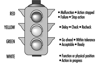
- Use lights, often coloured, to indicate the status of a system (such as ON or OFF) or to alert the operator that the system, or a subsystem, is inoperative and that special action must be taken. Common meanings of light colours are listed in figure 5. Flashing red indicates an emergency condition that requires immediate action. An emergency signal is most effective when it combines sounds with a flashing red light.
Figure 5. Colour coding of indicator lights
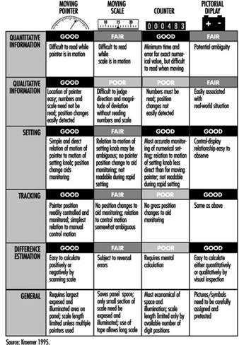
For more complex and detailed information, especially quantitative information, one of four different kinds of displays are traditionally used: (1) a moving pointer (with fixed scale), (2) a moving scale (with fixed pointer), (3) counters or (4) “pictorial” displays, especially computer-generated on a display monitor. Figure 6 lists the major characteristics of these display types.
Figure 6. Characteristics of displays
It is usually preferable to use a moving pointer rather than a moving scale, with the scale either straight (horizontally or vertically arranged), curved or circular. Scales should be simple and uncluttered, with graduation and numbering so designed that correct readings can be taken quickly. Numerals should be located outside the scale markings so that they are not obscured by the pointer. The pointer should end with its tip directly at the marking. The scale should mark divisions only so finely as the operator must read. All major marks should be numbered. Progressions are best marked with intervals of one, five or ten units between major marks. Numbers should increase left to right, bottom to top or clockwise. For details of dimensions of scales refer to standards such as those listed by Cushman and Rosenberg 1991 or Kroemer 1994a.
Starting in the 1980s, mechanical displays with pointers and printed scales were increasingly replaced by “electronic” displays with computer-generated images, or solid-state devices using light-emitting diodes (see Snyder 1985a). The displayed information may be coded by the following means:
- shapes, such as straight or circular
- alphanumeric, that is, letters, numbers, words, abbreviations
- figures, pictures, pictorials, icons, symbols, in various levels of abstraction, such as the outline of an airplane against the horizon
- shades of black, white or gray
- colours.
Unfortunately, many electronically generated displays have been fuzzy, often overly complex and colourful, hard to read, and required exact focusing and close attention, which may distract from the main task, for example, driving a car. In these cases the first three of the four “cardinal rules” listed above were often violated. Furthermore, many electronically generated pointers, markings and alphanumerics did not comply with established ergonomic design guidelines, especially when generated by line segments, scan lines or dot matrices. Although some of these defective designs were tolerated by the users, rapid innovation and improving display techniques allows many better solutions. However, the same rapid development leads to the fact that printed statements (even if current and comprehensive when they appear) are becoming obsolete quickly. Therefore, none are given in this text. Compilations have been published by Cushman and Rosenberg (1991), Kinney and Huey (1990), and Woodson, Tillman and Tillman (1991).
The overall quality of electronic displays is often wanting. One measure used to assess the image quality is the modulation transfer function (MTF) (Snyder 1985b). It describes the resolution of the display using a special sine-wave test signal; yet, readers have many criteria regarding the preference of displays (Dillon 1992).
Monochrome displays have only one colour, usually either green, yellow, amber, orange or white (achromatic). If several colours appear on the same chromatic display, they should be easily discriminated. It is best to display not more than three or four colours simultaneously (with preference being given to red, green, yellow or orange, and cyan or purple). All should strongly contrast with the background. In fact, a suitable rule is to design first by contrast, that is, in terms of black and white, and then to add colours sparingly.
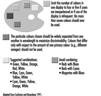
In spite of the many variables that, singly and interacting with each other, affect the use of complex colour display, Cushman and Rosenberg (1991) compiled guidelines for use of colour in displays; these are listed in figure 7.
Figure 7. Guidelines for use of colours in displays
Other suggestions are as follows:
- Blue (preferably desaturated) is a good colour for backgrounds and large shapes. However, blue should not be used for text, thin lines or small shapes.
- The colour of alphanumeric characters should contrast with that of the background.
- When using colour, use shape as a redundant cue (e.g., all yellow symbols are triangles, all green symbols are circles, all red symbols are squares). Redundant coding makes the display much more acceptable for users who have colour-vision deficiencies.
- As the number of colours is increased, the sizes of the colour-coded objects should also be increased.
- Red and green should not be used for small symbols and small shapes in peripheral areas of large displays.
- Using opponent colours (red and green, yellow and blue) adjacent to one another or in an object/background relationship is sometimes beneficial and sometimes detrimental. No general guidelines can be given; a solution should be determined for each case.
- Avoid displaying several highly saturated, spectrally extreme colours at the same time.
Panels of Controls and Displays
Displays as well as controls should be arranged in panels so they are in front of the operator, that is, close to the person’s medial plane. As discussed earlier, controls should be near elbow height, and displays below or at eye height, whether the operator is sitting or standing. Infrequently operated controls, or less important displays, can be located further to the sides, or higher.
Often, information on the result of control operation is displayed on an instrument. In this case, the display should be located close to the control so that the control setting can be done without error, quickly and conveniently. The assignment is usually clearest when the control is directly below or to the right of the display. Care must be taken that the hand does not cover the display when operating the control.
Popular expectancies of control-display relations exist, but they are often learned, they may depend on the user’s cultural background and experience, and these relationships are often not strong. Expected movement relationships are influenced by the type of control and display. When both are either linear or rotary, the stereotypical expectation is that they move in corresponding directions, such as both up or both clockwise. When the movements are incongruent, in general the following rules apply:
- Clockwise for increase. Turning the control clockwise causes an increase in the displayed value.
- Warrick’s gear-slide rule. A display (pointer) is expected to move in the same direction as does the side of the control close to (i.e., geared with) the display.
The ratio of control and display displacement (C/D ratio or D/C gain) describes how much a control must be moved to adjust a display. If much control movement produces only a small display motion, once speaks of a high C/D ratio, and of the control as having low sensitivity. Often, two distinct movements are involved in making a setting: first a fast primary (“slewing”) motion to an approximate location, then a fine adjustment to the exact setting. In some cases, one takes as the optimal C/D ratio that which minimizes the sum of these two movements. However, the most suitable ratio depends on the given circumstances; it must be determined for each application.
Labels and Warnings
Labels
Ideally, no label should be required on equipment or on a control to explain its use. Often, however, it is necessary to use labels so that one may locate, identify, read or manipulate controls, displays or other equipment items. Labelling must be done so that the information is provided accurately and rapidly. For this, the guidelines in table 4 apply.
Table 4. Guidelines for labels
|
Orientation |
A label and the information printed on it shall be oriented |
|
Location |
A label shall be placed on or very near the item that it |
|
Standardization |
Placement of all labels shall be consistent throughout the |
|
Equipment |
A label shall primarily describe the function (“what does it |
|
Abbreviations |
Common abbreviations may be used. If a new abbreviation is |
|
Brevity |
The label inscription shall be as concise as possible without |
|
Familiarity |
Words shall be chosen, if possible, that are familiar to the |
|
Visibility and |
The operator shall be able to be read easily and accurately at |
|
Font and size |
Typography determines the legibility of written information; |
Source: Modified from Kroemer, Kroemer and Kroemer-Elbert 1994
(reproduced by permission of Prentice-Hall; all rights reserved).
Font (typeface) should be simple, bold and vertical, such as Futura, Helvetica, Namel, Tempo and Vega. Note that most electronically generated fonts (formed by LED, LCD or dot matrix) are generally inferior to printed fonts; thus, special attention must be paid to making these as legible as possible.
- The height of characters depends on the viewing distance:
viewing distance 35 cm, suggested height 22 mm
viewing distance 70 cm, suggested height 50 mm
viewing distance 1 m, suggested height 70 mm
viewing distance 1.5 m, suggested height at least 1 cm.
- The ratio of strokewidth to character height should be between 1:8 to 1:6 for black letters on white background, and 1:10 to 1:8 for white letters on black background.
- The ratio of character width to character height should be about 3:5.
- The space between letters should be at least one stroke width.
- The space between words should be at least one character width.
- For continuous text, mix upper- and lower-case letters; for labels, use upper-case letters only.
Warnings
Ideally, all devices should be safe to use. In reality, often this cannot be achieved through design. In this case, one must warn users of the dangers associated with product use and provide instructions for safe use to prevent injury or damage.
It is preferable to have an “active” warning, usually consisting of a sensor that notices inappropriate use, combined with an alerting device that warns the human of an impending danger. Yet, in most cases, “passive” warnings are used, usually consisting of a label attached to the product and of instructions for safe use in the user manual. Such passive warnings rely completely on the human user to recognize an existing or potential dangerous situation, to remember the warning, and to behave prudently.
Labels and signs for passive warnings must be carefully designed by following the most recent government laws and regulations, national and international standards, and the best applicable human engineering information. Warning labels and placards may contain text, graphics, and pictures—often graphics with redundant text. Graphics, particularly pictures and pictograms, can be used by persons with different cultural and language backgrounds, if these depictions are selected carefully. However, users with different ages, experiences, and ethnic and educational backgrounds, may have rather different perceptions of dangers and warnings. Therefore, design of a safe product is much preferable to applying warnings to an inferior product.

